My template, Nirmala, is full-screen, which is perfect for the front page. But posts themselves are full-screen too, which seems little TOO wide, don’t fit well into range of vision:
Would be logical to assume that we need to add another custom CSS, something like
.single-post {
max-width: 800;
}
But no, it doesn’t work. Well… looks like WordPress isn’t much easier than Cross-platform 3D… At least for me…
Professional advice from Artem Demin:
We can set width limit for ALL pages EXCEPT home.
By default, the post will be aligned to the left. If we want to place it in the center (we do), then we should specify margins.
Go to Dashboard -> Appearance -> Customize -> Additional CSS
and add
.site-main {
max-width: 700px;
margin-left: auto;
margin-right: auto;
}
.home .site-main {
max-width: 100%;
}
Then – Publish.
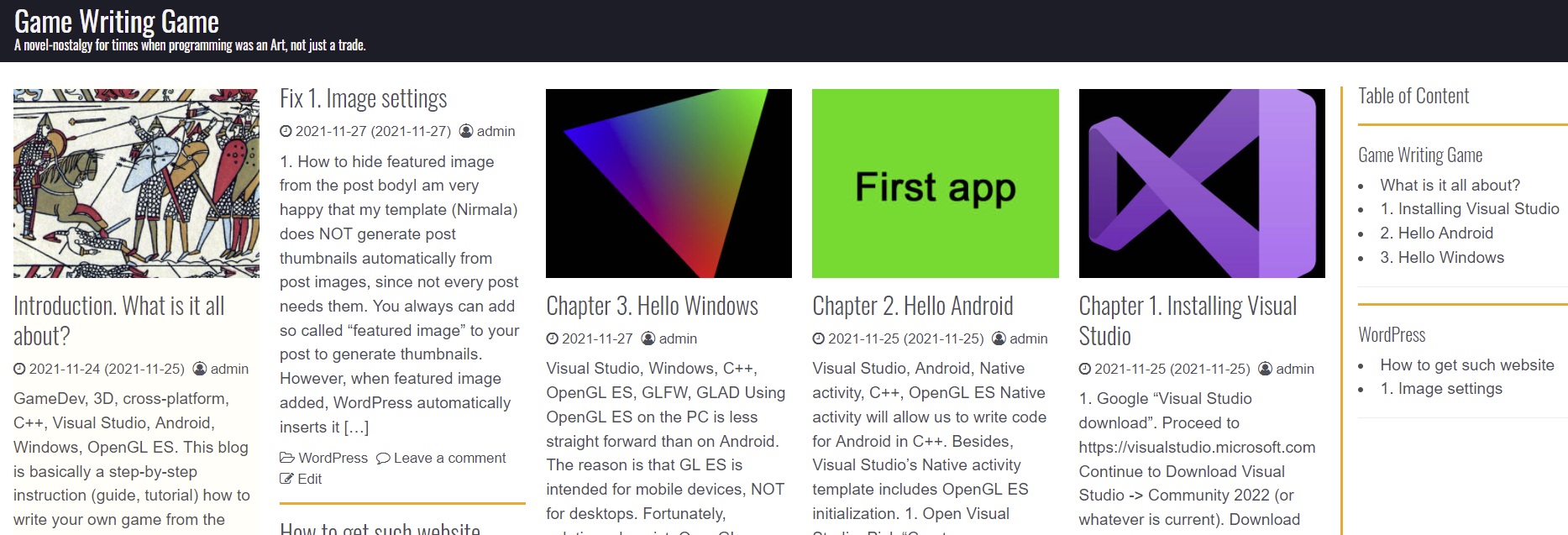
Now:
2. Main page columns size
Main (home) page in my template was splitted in 3 columns (max for widest resolution). The columns, accordingly, were pretty wide. 5 columns would look more reasonable. I suspected that number of columns or max column width – just another parameters in CSS. Again, I was wrong.
Professional advice from Artem Demin:
We are dealing here with adaptive design, which activates different layouts depending on screen width. So, we need 5 different layouts, a separate layout for each number of columns. Each layout must specify when it should be activated (in which screen widths range). So, the code will be:
/* columns N */
@media (min-width: 300px) and (max-width: 600px) {
.card-columns {
-moz-column-count: 1;
column-count: 1; }
}
@media (min-width: 600px) and (max-width: 900px) {
.card-columns {
-moz-column-count: 2;
column-count: 2; }
}
@media (min-width: 900px) and (max-width: 1200px) {
.card-columns {
-moz-column-count: 3;
column-count: 3; }
}
@media (min-width: 1200px) and (max-width: 1500px) {
.card-columns {
-moz-column-count: 4;
column-count: 4; }
}
@media (min-width: 1500px) {
.card-columns {
-moz-column-count: 5;
column-count: 5; }
}
Add this code to Dashboard -> Appearance -> Customize -> Additional CSS
Publish
Before:
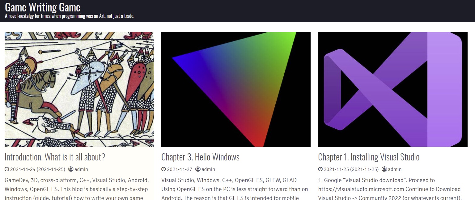
After:
- If you are using right side bar, you can limit it’s width by:
/*right side-bar*/
@media (min-width: 1600px) {
	.col-xxl-2.widget-area {
		max-width: 250px;
		font-size: small;
  		border-left: 3px solid orange;
	}
}
3. Delimiters (separators) between posts
To make borders between sections more notable, I also added:
/*delimiters*/
hr {
  border-top: 3px solid orange;
}
hr.wp-block-separator {
  border-top: 3px solid orange;
}
.card {
	border-bottom: 3px solid orange;
}
- hr.wp-block-separator – it’s hr inside posts.
- .card – is a post announcement on a home page.
Now: